Using JupyterHub and Data Analysis
This document has been machine translated.
This page explains how to access JupyterHub (data analysis environment using Python) in the installed Edge environment and visualize data acquired from the database in the environment using graphs and maps.
Preparation
The following must be done in advance. The following must be done in advance (described separately)
- Install Edge and create a JupyterHub user
Try to use JupyterHub
1. Login to JupyterHub
https://<xData Edge IP address>/jupyter
Access the above in a browser (latest version of Chrome) and login with the Username and Password of the user you have created. 2.
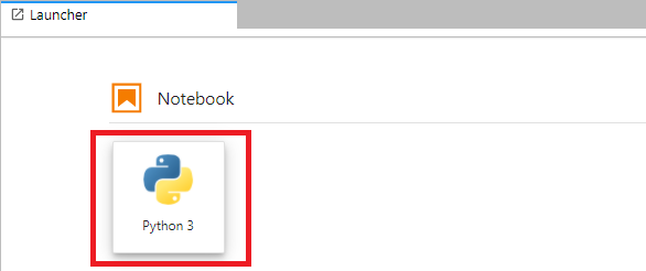
2. Create Notebook file
First, create a Notebook file as a workspace for data analysis. Click the button below from the Launcher to create a new Notebook file.
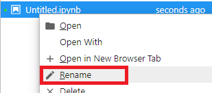
The file name is Untitled.ipynb, change it to hello.ipynb.
3. First Python program execution
Have hello.ipynb open.
You should see an empty cell (a box for entering code) on the screen.
Type the following into this cell.
print('Hello, Jupyter!')
Once entered, click the Run button at the top of the screen. You will see ``Hello, Jupyter!
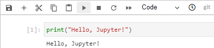
Now you can run your Python program on the Notebook.
Perform data analysis with JupyterHub (space)
Next, create a Notebook that uses the Web API to retrieve risk map data and display it on a map.
The sample Notebook in this section is located in /opt/xdata-edge/sample/riskmap_api_sample.ipynb on the Edge Jupyter container. You can copy this file to your Jupyter workspace and run it.
1. Create a new Notebook file for analysis
Create a new Notebook file.
The file name is arbitrary, but in this example, we use map.ipynb.
Open map.ipynb and proceed to the next step.
2. Retrieve data from the risk map table
In the first cell, enter the following code.
Change api_endpoint, api_key, and api_secret to suit your environment.
from dashboard_modules import EvwhDataSet
dataset = EvwhDataSet(
    api_endpoint = 'http://webapi-endpoint/api/v1/evwhapi/jsonrpc',
    api_key = '[API Key]',
    api_secret = '[API Secret]',
)
options = {
    'tables': ['riskmap_sample_tbl'], # Specify acquisition theme
    'boundary': (139.0, 35.0, 140.0, 36.0), # Specify latitude and longitude (min, max) of acquisition range
    'start_datetime': "2022-01-01 00:00:00", # Specify time of acquisition
    'target_theme_mesh_degree': 4, # Specify mesh granularity level in the range 1-4
    'timezone': "Asia/Tokyo", # Specify the time zone of the time of the acquired data
}
dataset.load(options)
Executing this will retrieve data from the database risk map table and event table using the risk map extension API. After the busy state ([*] is displayed on the left side of the cell) is over, the retrieval is complete and we can proceed.
3. Check the acquired data
Press the Add Cell button, add a new cell, and execute the following code.
dataset.get_event_dataframe('riskmap_sample_tbl')
You can see the contents of the obtained risk map data (in Pandas' Dataframe format).
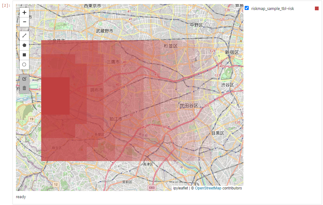
4. Display on a map
Finally, we display the data distribution over space by displaying it on a map. Add a cell, enter the following code, and run it.
from dashboard_modules import DatetimeRangeSlider, MapView

mapview = MapView(dataset)
mapview.map.center = (35.69, 139.69)

mapview.display()
When executed, the map is displayed. The data distribution is not displayed at first, but can be displayed by turning on the checkbox to the right of the map. The map will be displayed in darker colors for areas with high data values and lighter colors for areas with low data values.